black, white & grey cover
Reviews

Review: Black, White & Grey

Hugo Boylan – the twisted mind behind Malevolence – sent me on a review copy of his new book with Rapha Lobosco, Black, White & Grey. As with all my reviews, I have a tendency to focus on the positive – especially true when I know the creator. Consider this a ‘Why you should buy this comic’ post (because I know this is one I’d love to have a physical copy of!)

Black Lines, Grey Morals

Hugo Boylan is, in my mind, a horror writer. The first book of his that I read was a horror, so the genre sticks in my head. This new book contains five stories: DreamweaverDay JobMurphy’s DayHeavy Black, and Black Neptune. It’s hard to tell which one disturbs me most. Conceptually, they’re all different. As stories, they’re paced differently, and rely on different scare tactics. The twists, the intrigues, the Big Bads, they vary between each story. And while it’s true to say that Boylan writes horror, and that each story contains elements of horror, there’s a greater depth of genre available in this book, when one looks at the stories separately.

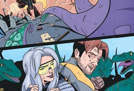
Heavy Black is certainly closer to science fiction in terms of its content, while Murphy’s Day relies on the expectation of an incident to keep the reader guessing, set in an otherwise contemporary world. The final story in the book, Black Neptune, is extracted from a larger story, but contains enough of the tale to raise the question that a good story ought to: just what is going on?

To complement Boylan’s writing, Rapha Lobosco fills in the pages with – you might guess from the book’s title – a blend of black, white and grey artwork. Artistically, it can appear as a choice between colouring the art, or telling a story in black and white line-work. Conceptually, especially in a collection, the use of black, white and grey creates different atmospheres for the stories. Those told in black-and-white only are the stories that rely on twists and contrasts; what appear to be simple stories take sharp turns in the opposite direction.

When grey is introduced, we’re given two different uses of the colour; Heavy Black makes use of grey to emphasise the darkness of space (the story taking place on-board a craft in space), whereas Murphy’s Day uses grey as a means of dropping us in the middle of the story wondering where we might be taken – there is no clear-cut jump, only a wait for the shift in the story, something we have to drift through, like searching in murky water for a prized jewel. (Analogy spoiler alert: we find the jewel.)

Added to the stories are an original script – which is a nice addition from Boylan – for Dreamweaver, and concept art from Lobosco – always something I like to see at the end of a book. With a dark and dreary design pulled together by the book’s letterer, Kerrie Smith, we’ve given an impressive collection of stories from two of the finest up-and-coming comic creators in Ireland.

Black, White & Grey launches at Thought Bubble 2016 (that’s this coming weekend, folks). It’s a clever collection of intriguing stories, definitely one for fans of horror, and receives an all-round recommendation from me. You can check out Heavy Black on Taptastic in its entirety if you want a taste of what the collection is like.

100-more-times-cover
Reviews

Review: 100 Times (+More Times)

Katie Fleming sent me a review copy of 100 More Times – the sequel to 100 Times. I didn’t get to review the first book, so consider this a look at the series so far. As with many of my reviews, this comes with friendship-bias. To avoid unfairly weighting things in their favour, I tend not to be the Big Review Guy, and instead focus on the things that make the books awesome. Thankfully, my catch-line for these books does the job:

Gay Werewolves

100 Times (by Katie Fleming and E. Kerr) introduces us to two characters: Myran and Quill. Myran is a human. Quill is a werewolf. They’re kinda gay for each other. (They’re really gay for each other, and it’s a glorious celebration of same-sex relationships.)

100-times-coverLet’s be clear early on: Quill’s werewolf nature is mostly a plot device. He doesn’t eat people throughout the book. (Spoiler? I mean, these aren’t horror comics.) Instead, Fleming and Kerr use other aspects of being a werewolf as elements of the story – most notably in the first book, the pack. Every werewolf has a pack, and it’s this introduction of Myran to Quill’s pack that becomes the centre of the first story.

Much as one would meet their partner’s family for the first time, and the usual struggles of worrying if the relationship would be accepted, Quill struggles with the notion of introducing his human partner to his werewolf family.

It’s an incredibly endearing story, and it doesn’t end with the pack.

More Times

When we reach book two, we’re faced with another dilemma between the couple: a disconnect about the meaning of family, how one (Quill) avoids talking to/about his, and how the other (Myran) values his.

We won’t get super spoilerific about it, but it’s a similar sort of story to the first book, building upon the relationship between our protagonists.

The books aren’t dialogue heavy, relying on a few key words each way, and a guided narrative with charming artwork to tell the story instead.

A big part of me just wants to celebrate the everything that has to do with the gay werewolf aspect of the books. The English graduate in me wants to celebrate the analogy between homosexuality and lycanthropy, or the parallels between human-werewolf relationships and white-and-black relationships in the early twentieth century. You can choose to appreciate those nods to romantic difficulties in history, if it so pleases you. Otherwise, I’d just pick the books up to enjoy the exploration of a relationship across the varying struggles of romance.

100 More Times is launching at Thought Bubble this weekend. Be sure to check it out, and tell Katie I said hi!

solstice-1-winter-cover
Reviews

Review: Solstice #1

I first met Nathan Donnell of Revolve Comics in 2015, at a cosplay convention in Dublin, back when he was working with another company. With Revolve, he’s produced Solstice, a fantasy comic that I picked up from him at Q-Con expecting, at the very least, some beautiful art.

Winter is Coming, and It’s Here to Stay

Solstice Chapter 1: Winter was my first time encountering the writing of Danny McLaughlin, the Derry-based publisher of Revolve Comics. I didn’t buy the comic with any expectations; after all, my purchase was to support an artist I knew. I was pleasantly surprised when, following a busy day at Q-Con in June, I found myself sucked into the incredible world McLaughlin had built within the pages of this first issue.

The world is stuck in an eternal winter. The comic’s hero, Finn, has the task ahead of her to become the new Herald. As the story unfolds, she must track down and kill the Winter God’s wolf totem. Until she can do that, winter will never end.

It was an interesting premise, one that kept me gripped the entire time, post-con exhaustion be damned.

Combined with the stunning art of Nathan Donnell, this is a story worth diving into. Coloured in a cold blue, Solstice is the epitome of winter, with dashes of other colours through the book used sparingly and for maximum impact. And it’s colour, used in this way, that really brings Donnell’s artwork to life. With a very green second issue on its way, it’ll be interesting to see how effective it’ll be as the series continues.

diabetes type 1 comicIn the meantime, Revolve Comics have put out a free comic about type 1 diabetes. You can check it out on their website while we wait for Spring.

Ness Cover
Reviews

Review: Ness #1

A few weeks ago (okay, more than a few weeks) Rob Carey put out a call for people to review Ness #1. Having been mostly absent from the Blogosphere since he sent me the digital copy of the comic, it has taken a considerable amount of time to produce a review – which, as with all of my reviews, functions best as a shopping guide for those with an interest in Irish comics.

Not the Nessie You Think You Know

As I set out to write this review, I asked my brother what was the first thing that came to mind when I saw ‘Ness’. His response: Nessie. As in, the dinosaur-monster from Loch Ness. And that’s the premise of Ness: there’s a monster in the lake. The difference is, this one is made of nightmares and tentacles, and any sightings you might have it are likely to be short-lived – like you. Drawing upon Lovecraftian horror to back up this Made of Nasty beastie with some Made-to-Feel-Genuine folklore, writer Chris Welsh gives us a fresh take on the myth of Loch Ness.

With a cast of four protagonists to guide us through the first issue, a believable excuse for their being there when they are, and an intriguing storyline filled with suspense from its dark beginnings, Welsh is definitely onto a winner with Ness.

Supported by deeply engaging art from Rob Carey, which perfectly captures an imagined Scotland and the nightmare that is their Nessie, and alluring colours from Dee Cunniffee, Ness is a comic worth checking out for fans of Fantasy, Horror or Adventure stories, but not for the feint-hearted. It’s gruesome and gory, and all things wonderful this time of the year.

Even better is that the second issue is on its way already! Following a successful Kickstarter campaign – and I’m not surprised in the slightest, given the first issue that Carey graced with me – we’ll be seeing the new issue pretty soon, with expected delivery dates for print copies in December this year. (It’s a horrifying Christmas present to mysellf, and I can’t wait!)

Celtic Clan Cover
Reviews

Review: The Celtic Clan 1-3

Nigel Flood from Punt Press sent me The Celtic Clan 1-3 to review. Looking at this from a Road So Far point of view, I’ve combined the review of the series to this point into one post, taking a look at series overall, rather than on an issue-by-issue basis. As always, I aim for the most positive aspects of a book as much as possible in my reviews.

Another Irish Superhero Story?

For such a small country, our comic creators love to create large teams of Irish superheroes. Buttonpress have one. Cremona Press have one. And, though they also release other titles, Punt Press have one. There’s always a problem with scale when it comes to superhero stories – just how many characters should you attempt to fit into one story? – and I think for the most part, Flood and co. have the max figured out. The Celtic Clan featured in the book, if you ignore the additional ensemble of supporting heroes, is enough to make the difference on the panels, and allows for a few different stories to be told at once.

I should say, I preferred Flood’s other work – The Globalists – but there’s a lot of fun to be had in the pages of The Celtic Clan. It’s definitely a more jovial comic, not quite on the all-ages spectrum of Buttonpress comics, but with a lot of the humour that a more violent comic needs when the cast are wearing spandex.

Villainsssssss

When I initially read the comics, I thought the idea for the villains was a bit…silly? I’ll settle on silly. I even thought that when I was tired and made my notes for this very review. Several days later, and taking into account everything I’ve already said, I revise that statement.

The villains of the comics are snake people. Yes, snake people. Lizard people, maybe. But definitely reptilian in nature, with a fun throwback to one of the strangest conspiracy theories we still occasionally hear about – the underground lizard people who rule the world!

Flood takes advantage of this to cast an eye back into Irish history, and manages to create a greater sense of mythos within his comics than three issues should really allow. (Bravo on that!)

The books are fast-paced, and artist Frank J Right succeeds in driving the story along expertly, and fleshing out the details on a wholly bizarre set of characters, seemingly without issue.

(And, it should be said, the characters vary in so many different ways. There’s a cat-man, lizard-people, a pixie-esque-woman, a classic warrior, a barbarian-ish old man, a speedster in spandex, and a monster made from whatever the ground can provide, be it turf, concrete or street poles. Despite the massive mix, he manages not to deviate from his style, and depicts everything skilfully.)

All in all, The Celtic Clan is a fun series. It’s worth checking out if you like superhero comics and want to support small press. How long we’ll have to wait for issue 4, however, remains to be seen.

Malevolence Cover
Reviews

Review: Malevolence

Launched at Dublin Comic Con, and then again in a library in Clonmel (because libraries are cool, and that’s where the artist lives), Malevolence is a new horror comic from writer Hugo Boylan and artist John Quigley, with Dearbhla Kelly on Colours and Kerrie Smith on Letters. John asked me, before I met him at DCC and talked the ear off him (and attempted in vain not to be sold almost everything from his table), if I would review Malevolence. As usual, don’t take the review too critically – I know I won’t while writing it!

Twisted

One word sums up the book. Twisted. From Boylan’s writing, to Quigley art, Kelly’s colours, and even Smith’s lettering. The individual elements of this comic twist together to make something uniquely engaging. I wouldn’t want to spoil the plot for you, but the basics you need to know about Malevolence are these simple facts:

1. The comic takes place across three decades.

2. The comic is filled with fleeting moments of madness.

3. The comic wouldn’t make much sense without Kelly and Smith’s contributions.

Colourful Dread

Most comics can get along with a strong story and a skilled artist. Black & White is an acceptable standard for storytelling. But colour brings this one to life. Colour is the only way we know when we are within the story. Colour invites us through three decades of horror. Without colour, an element so vital to this book, everything else would need to change. The book would need to be re-panelled, re-organised, maybe even re-written to a more linear story. But linear is common. Colour allows for Boylan and co. to create their non-linear nightmare.

Colour is the vital piece of dread that the books need to truly come alive.

When Smith’s lettering gets taken into account, the genre of the book is really played up expertly. There’s a lesson to be learned from letterers all-over about how to turn a writer’s words into part of the art itself within Malevolence.

The book builds upon a beautifully horrid concept and executes it in terrifying fashion.

You can get your hands on Malevolence – and you really should – from Hugo Boylan and John Quigley directly. Hugo can be found at @HugoBoylan; John can be found at @johnquigley209.


Flare One Shot Cover
Reviews

Review: Flare One-Shot Comic

This site is new. Reviews are new to this site. Paddy Lennon graced me with a digital review copy of the Flare One-Shot comic earlier this week, and it should be said that I typically avoid reviews due to the struggle of maintaining objectivity. in lieu of an official review policy and statement (maybe when the DCC madness subsides I can get on that), please accept here and now that I will not be giving a star-rating on any reviews here. What I will do is tell you what I liked, and point out some things that I thought might have helped improve a comic, coming from someone with a storytelling background and some limited experience in design and illustration.


Onto the review!

One thing that should be noted about this one-shot comic is that it isn’t a single, self-contained story. This has its ups and downs. On the plus side, we get a nice introduction to three distinct protagonists. I liked the different stories told within the comic book. They were unique tales, told from very different worlds, but all by one author; they shared a voice, and it was a comfortable read. On the flip side of this, there’s a regrettable absence of depth to the stories overall. I was keenly aware that there were larger stories being hinted at within the pages of the comic, but before we were given any further experiences of the characters or the world they inhabit, the next story would begin.

Don’t get me wrong, this was a fun book. The collection was enjoyable. Paddy Lennon can certainly tell a good story – he does it three times within one issue. I only wish the stories might have been longer. (The related novels Lennon wrote before this comic, I suppose, are where we might get our fix of the longer stories.) For newcomers to Lennon’s work, there can be an absence of backstory to everything that happens within the pages of this book.

However, despite the limited length of the stories – understandable given the constraints of a single-issue comic – they work well as a set. Perhaps more significantly, Lennon and co. told these tales with different illustration styles taking control of each story. Where First Date is told as a full-colour, vibrant superhero tale, Wolfhound is a gritty, scratchy noir tale. The final story, One Day in Tokyo, is told with a mix of the vibrancy of First Date, with a nostalgic pallet during the story’s most critical points.

The creative team behind the Flare One-Shot comic say an awful lot together, demonstrating the amazing potential of this comics team. While readers may find themselves looking for more, we can rest assured that Lennon’s stories are not confined to panelled pages – Flare and Shooting Star are both also available as novels, minus the graphic elements. The book is definitely worth checking out, and launches at Dublin Comic Con 2016.